
How making data feel valuable helped double revenue
Role: Product Designer (Strategy, UX/UI)
Timeline: 2022 to 2024
Team: Product Manager, Marketing, Engineering
Impact
- Helped double year-over-year revenue, two years running
- Shipped a year-end report that celebrated each user's year of effort
- Launched weekly insight reports that turned silent data into a felt payoff
- Stood up a supplement shop, a brand new revenue stream
- Cracked the "lonely app" problem by making invisible value finally visible
The problem: a product that worked, but didn't feel like it
Wild.AI made a bold promise at onboarding: personalized insights built around your hormonal cycle. So users held up their end. They logged sleep, training, and symptoms, day after day. The app crunched it all into a single daily readiness score.
Then I ran a round of user interviews, and one participant, a business coach, handed me the sentence that reframed the whole project. Users were logging faithfully, but they had no sense that anything was happening with their data. The word that kept coming up was lonely.
The gap was brutal once you said it out loud:
What we promised: "We know you. We'll help you make sense of your data."
What we actually delivered: "Here's a number. See you tomorrow."
There was no signal their data was being used, and no sense of progress. The real, compounding value stayed locked away until week four or later, long after most people decide whether an app is worth paying for. Our biggest dropoff was day 7.
And that was the business problem. Users who couldn't feel the value didn't convert. The product was genuinely delivering. People just couldn't see it. We weren't failing to create value. We were failing to show it.
The solution: close the loop, open a new revenue stream
Working with the PM, I designed feedback loops at two rhythms, so the value showed up whether a user opened the app this week or once a year:
- Weekly: short-term validation that the data is working
- Yearly: a big, emotional celebration of everything they'd done
I chose those two intervals deliberately, to cover both kinds of user: a weekly rhythm for the people who open the app constantly, and a yearly one for the people who log quietly and rarely look back. Before committing engineering time, I pressure-tested both concepts against the same interview pool that surfaced the "lonely" problem, so we were building against a real complaint, not a guess.
Year-end report: the idea I championed for two years
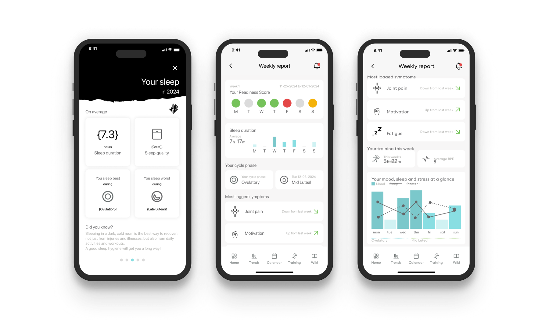
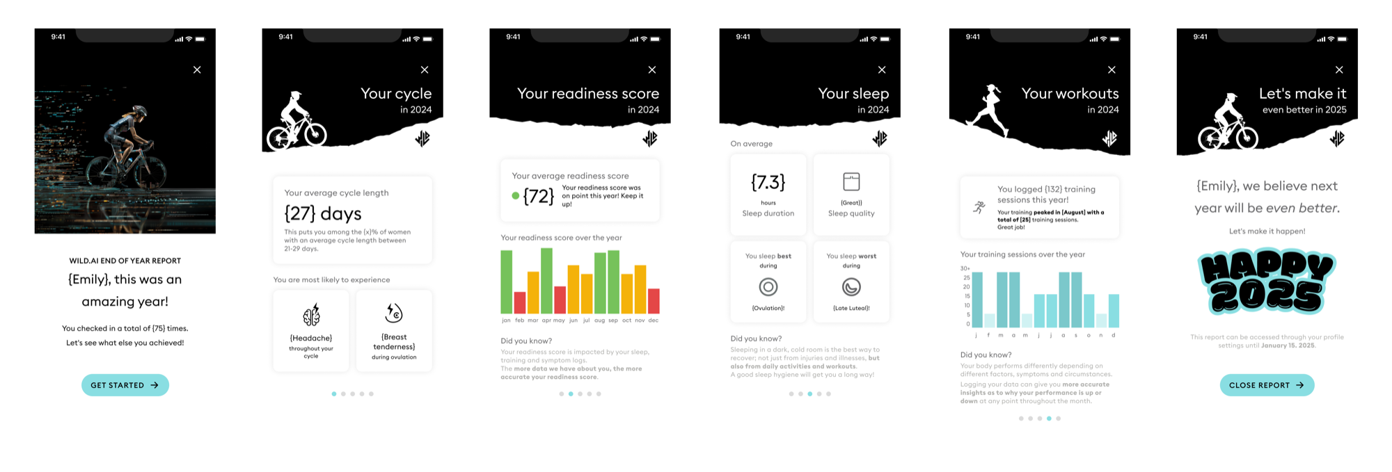
Inspired by Spotify Wrapped, I designed an in-app moment that handed each user their year back as a story:
- Cycle patterns: "Your average cycle: 27 days"
- Performance trends: "Your average readiness: 72"
- Sleep insights: "You slept best during ovulation"
- Training milestones: "132 sessions logged!"
- Forward momentum: "Let's make 2025 even better"
It took two years to ship, not because it was complex, but because it kept losing to nearer-term work. Each roadmap cycle I brought it back with a tighter scope, until the version on the table was small enough for the team to say yes to.
Why it landed: it proved every logged entry had added up to something. A year of quiet effort, suddenly visible and worth being proud of.
Weekly reports: the same payoff, every seven days
The PM pushed for a more frequent touchpoint than our existing monthly report. Rather than design something new, I treated the weekly report as a redesign of the monthly one: the same underlying data, with far less of it on screen. The hard part was subtraction. Deciding what to cut so the whole week could be read in a few seconds instead of studied for minutes.
| Monthly reports | Weekly reports |
|---|---|
| Dense data visualizations | Simple insights |
| Full cycle overview | One-week snapshot |
| Technical | Actionable takeaways |
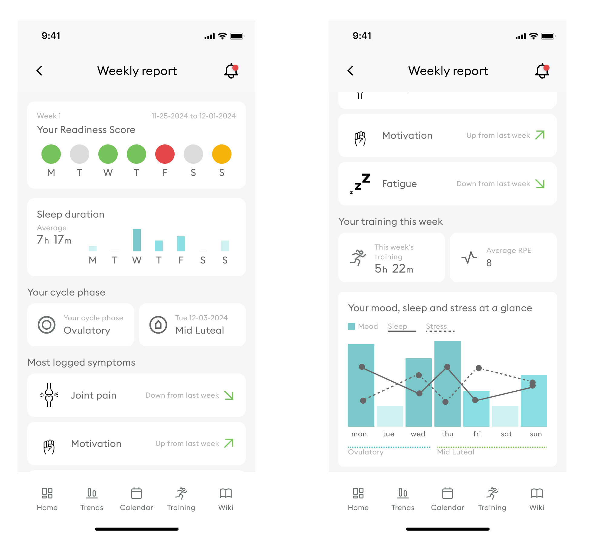
Each week, users saw their readiness patterns, sleep with a daily breakdown, current cycle phase, most-logged symptoms and trends, a training summary, and mood, sleep, and stress at a glance. The whole week, readable in a few seconds.
The engagement engine: push notifications deeplinked straight into each report, pulling users back in and lifting weekly activity.
One more lever: around the same time, the PM and I also stood up a Shopify-based supplement shop, a separate revenue stream alongside subscriptions. That's its own story rather than part of this one. Ask me about it.
Results & impact
We doubled year-over-year revenue, two years in a row.
That came from several levers pulling together: traffic, how we presented membership, and product diversification. My piece was the value side, making the membership feel worth keeping. By solving the "lonely app" problem and building loops that let users see what their data was doing, more of them crossed the line to paid and stayed there.
The counterintuitive part: retention and engagement barely moved. Perceived value is what jumped, and perceived value is what converted. Users who saw their year-end report or read a weekly insight finally understood why Wild.AI was worth paying for.
Before: "I log data but never see what happens with it."
After: "Look at my achievements. Wild.AI really knows me."
Key takeaways
- Perceived value drives revenue. The value was already there. Surfacing it is what moved the needle on conversion.
- Frequency keeps you top of mind. Weekly reports gave users a reason to come back, again and again.
- Delight creates loyalty. The year-end report wasn't just informative. It was a celebration, and people remember being celebrated.
- Small touches, big swings. Weekly reports were simple to design, and they fundamentally changed how the app felt.
Reflection
This project rewired how I think about growth. Revenue isn't only about shipping more features. Sometimes it's about helping users see the value they're already getting. And it isn't only about adding more users, since keeping the ones you have is usually the harder, more valuable work.
Wild.AI's data engine was genuinely powerful, but all the work happened off-screen. By building frequent, visible feedback loops, we turned the experience from "lonely" into "personalized."
What I'm proud of: I had pushed for the year-end report since 2022 and watched it finally ship in 2024. Some ideas just need time to mature and find their moment.
What I learned: design can move revenue directly, once the team understands the link between perception and business outcomes. Making value visible is as important as creating it.