Cutting a marketing website's bounce rate from 75.9% to 35.8%
When the website blocked the team that needed it most
I joined Wild.AI as design lead in September 2022. Within a week of pulling analytics, I had two numbers in front of me: a 75.9% bounce rate on the marketing site, and an internal queue stacked with marketing change requests waiting on engineering.
The visible problem was the bounce rate. Three out of every four people who landed on the homepage left immediately. Not "browsed a bit and decided it wasn't for them." Just left.
The deeper problem was inside the company. The marketing team couldn't update the homepage themselves. Couldn't change a headline. Couldn't swap a hero image. Couldn't launch a campaign landing page without filing a ticket and waiting for a sprint.
Submit a ticket → wait for engineering → pray it makes the next sprint → maybe see it live in two weeks.
That's like owning a bakery but needing to call a carpenter every time you want to change the "Today's Special" sign. The carpenter does great work, but by the time they show up, nobody wants croissants anymore.
The website was built for a tiny startup finding product-market fit. Wild.AI had grown into a scaling company with multiple user segments and product lines, and the marketing team (the people closest to what users were saying and what messages were landing) couldn't ship a single update without somebody else's calendar.
The bounce rate was the symptom. The disease was structural.
What follows is how a website rebuild became a case study in operational autonomy.
The Data Didn't Lie (Unfortunately)
I pulled the analytics and did a content audit. The story was clear, and it wasn't pretty.
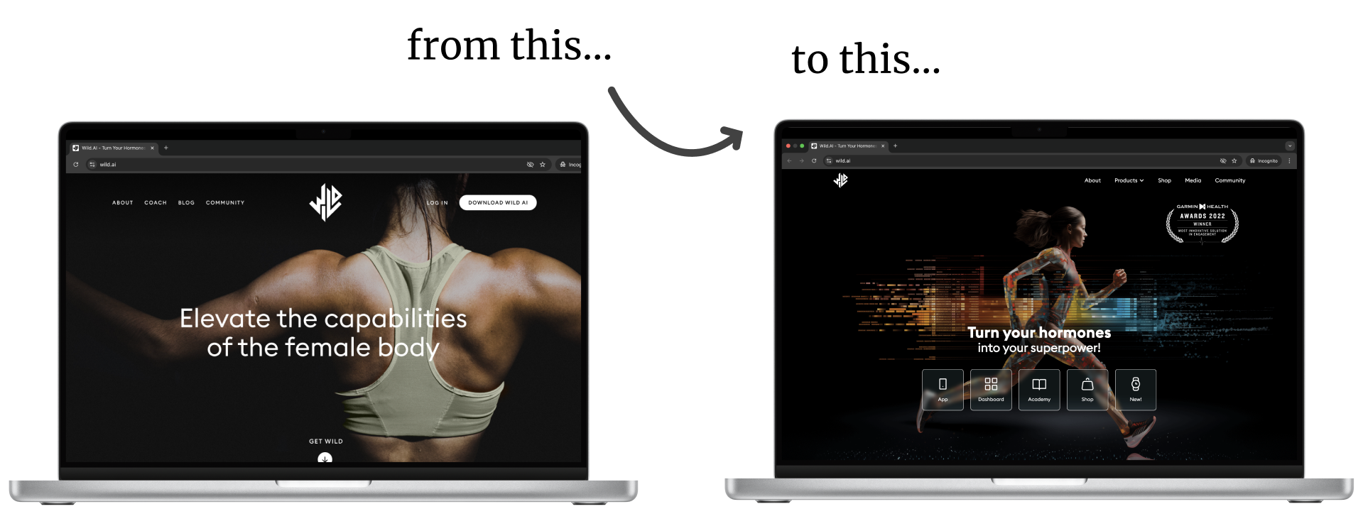
The homepage was structured like this: "Here's our app → These are the features → Here's pricing."
That works great when you have one type of user. But Wild.AI now had:
- Competitive athletes tracking performance metrics
- Amateur fitness enthusiasts managing their energy levels across life stages
- Coaches connecting with their athletes to monitor their performance and wellbeing
Everyone landed on the same generic homepage pitch. Nobody could quickly figure out: "Wait... is this actually for me?"
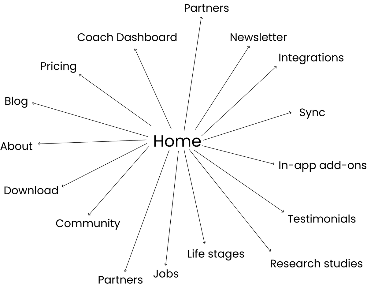
The navigation had 8+ items. The information architecture was based on the original product structure from 2+ years ago—not what Wild.AI had become. Content had been added organically over time, layer upon layer, without anyone stepping back and asking: "Does this still make sense?"
It's like rearranging furniture in your apartment for two years without ever questioning whether you still need that beanbag chair from college. (Spoiler: you don't.)
The goal wasn't to redesign just because redesigns are fun. It was to evolve the website to match where Wild.AI actually was as a company.
The Strategy: Fix the Foundation, Not Just Paint the Walls
I worked with Product and Marketing on the solution: migrate to Webflow and rebuild the information architecture from scratch.
Why Webflow?
Because marketing needed their independence. They needed to test messages, launch campaigns, respond to partnerships –without submitting tickets and waiting for engineering sprints. Webflow gave them that power back.
(Also, I knew Webflow. Which meant I could design AND build it myself, which would alleviate the dev bottleneck. More on that in a sec.)
What actually changed:
The fundamental shift was moving from product-focused to user-focused navigation.
Old structure (product focussed)
"Here's our app → Features → Pricing"
New structure (user focussed)
"Are you an athlete? → Here's how we help YOU specifically → Is this right for you? → Want to learn more?"
I'm sure you see the difference. Users could self-qualify in seconds instead of hunting through feature lists trying to figure out if any of this applied to them.
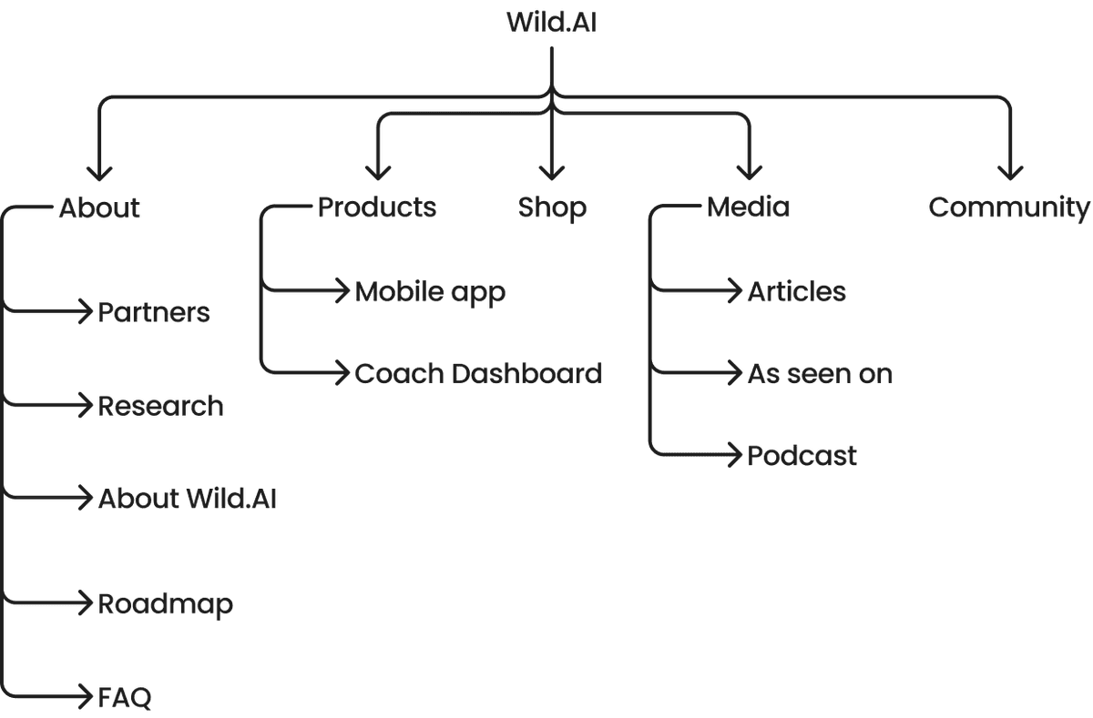
We simplified navigation from 8+ items to 5 core sections. Built a flexible visual system using AI-generated imagery (Midjourney, because stock photos of women stretching weren't going to cut it). Created a CMS structure so marketing could own content updates completely.
What we kept:
The brand voice that already resonated. Key design elements users recognized. The SEO equity built over two years.
Here's the thing: you don't throw out what works just to make something new and shiny. That's redesigning for the sake of redesigning, and it's ego-driven, not user-driven.
Building It (Yeah, All of It)
I was the sole designer with Webflow expertise. So I designed the entire thing. And then I built the entire thing. Three months, start to finish.
The information architecture shift:
Instead of explaining what Wild.AI does, we helped users figure out if it was for them.
That's the difference between:
- "We optimize training based on hormonal cycles" (feature)
- "Are you hitting walls in training that your coach can't explain?" (conversation)
One is a feature list. The other is a mirror you hold up to someone's actual experience.
The visual system:
AI-generated hero imagery (Midjourney) gave us unique, on-brand visuals without the stock photo problem. Gradient color system guided attention down the page naturally. Dark theme sections matched the mobile app aesthetic. Every component was built to be flexible—designed to adapt as the brand continued evolving.
Because here's the thing about startups: the brand identity is NEVER done. You need systems that can grow with you.
The technical build:
Responsive design, mobile-first (because have you SEEN mobile traffic lately?). CMS collections for blog posts, testimonials, partners, features. Parallax scrolling and smooth transitions where they actually enhanced the story—not just because they look cool. Custom Google Analytics integration. SEO optimization. Performance tuning.
My role: 100% design, 100% development.
No handoffs. No "lost in translation" moments. No back-and-forth where the developer interprets your design differently than you intended. Just... me, Webflow, and three months of caffeinated focus.
(Is this the ideal way to work on every project? No. But when you're moving fast and need high velocity, eliminating handoffs is a superpower.)
The Results (And Why They Actually Matter)
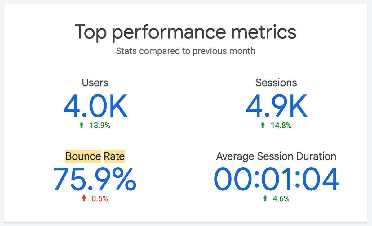
The redesign launched September 2023. The numbers are at the top of this case study; here's what they actually mean.
The bounce rate change wasn't a temporary spike. Most redesigns see a bump for a few months, then regress to the mean. This one held for two full years. That's how you know the changes were structural, not superficial.
People stayed
26 seconds is a long time on a homepage. Interior pages went further: /about averaged 43s, /coach-dashboard 31s. Visitors weren't just landing. They were reading, clicking around, working through the content. That's a different relationship to a marketing site than "look once, leave."
The operational impact (this is the part that compounds)
Content updates went from weeks to hours. Real example: a time-sensitive partnership announcement needed to go live. Under the old system: submit a ticket, wait for sprint planning, maybe see it in two weeks. Under the new system: marketing updated it themselves in two hours and went to lunch.
The 40% productivity gain isn't because the marketing team suddenly worked harder. It's because they could finally work independently. Full autonomy over content strategy. Rapid A/B testing. Faster response to market changes. More time for strategic work instead of logistics.
That's what good design actually does. It removes friction from the system so people can do their best work.
What I Actually Learned (The Stuff They Don't Teach You)
Strategy beats aesthetics every single time.
Restructuring the information architecture—moving from product-focused to user-focused—drove the 53% improvement more than any visual polish. Pretty designs don't fix structural problems. They just make structural problems look nicer.
Technical skills create velocity.
Building in Webflow myself eliminated handoff delays. Real-time iteration. Immediate feedback loops. No "telephone game" between design and development where things get lost in translation.
If you can design AND code (even just in Webflow), you're not just a designer—you're a force multiplier.
Operational efficiency compounds.
Empowering marketing to move independently created value that extended far beyond launch day. Every hour they didn't spend waiting on engineering was an hour they could spend on strategy, content, partnerships—the things that actually move the needle.
Design within constraints works.
AI-generated imagery and flexible guidelines let us ship fast while the brand identity was still evolving. Perfect is the enemy of shipped. (And shipped is what pays the bills.)
Sustained impact is the only metric that matters.
A 53% reduction that held for 2+ years proves the redesign was structurally sound. Temporary spikes mean nothing. Sustained performance means you actually solved the problem.
Real Talk: This Wasn't Starting From Zero
Here's something important: this redesign built on the foundation the original team created.
That early website established Wild.AI's brand presence. It validated the market. It built SEO authority. It did exactly what it needed to do at that stage of the company.
My role was to evolve that foundation to match where the company was NOW—scaling from 10 to 30+ people, multiple product lines, diverse user segments.
The lesson here: Good design acknowledges context. What works for an early-stage startup looks different at scale-up stage, and that's not failure—that's evolution.
You don't redesign because the old thing was bad. You redesign because the company outgrew what it needed before. Big difference.
Team and trade-offs
I worked with a product strategist (positioning across the new user segments, opportunity sizing per segment) and a product manager (scope decisions, stakeholder alignment between marketing and engineering). I owned design, IA, and the Webflow build.
The PM initially pushed for a phased migration: keep the old site live, migrate one section at a time. I argued for a clean rebuild on the grounds that the IA was the actual problem, and partial migration would preserve the broken structure under a new coat of paint. We compromised by running the rebuild in parallel with the live site, with a hard launch cutover. That let marketing keep shipping campaigns on the old site during the build and flip to the new one when ready, without a freeze.